Creatacard™ Builder
Redesigning the American Greetings digital greeting card builder.
Redesigning the American Greetings digital greeting card builder.

Apr '24 - Jun '24
UX Designer
UX Researcher
The old builder was clunky, unintuitive and didn't promote easy personalization. Each personalization option lived within its own modal that, once active, would get in the way of personalization and had to be moved around the screen by the user in order to see the card that they were personalizing. Often times these modals wouldn’t even fully appear on the screen and would be outside of the viewport.
We know personalization is everything. How might we simplify the personalization process so users can easily preview and edit their card without obstruction?
We began by analyzing competitor platforms such as Hallmark, Givingli, Evite, and Paperless Post to understand how others approached digital card personalization.
Key takeaways included:
Simple, persistent editing panels performed better than multiple modals.
Inline editing and clear visual cues encouraged faster customization.
Visual continuity between editing states helped users stay oriented.
These insights validated our hypothesis that personalization tools should be consolidated into a single, accessible location.
After sketching early ideas, we transitioned into Figma to explore layout and interaction patterns. The guiding design principle was unobtrusive control, giving users power to personalize while keeping the card front and center.
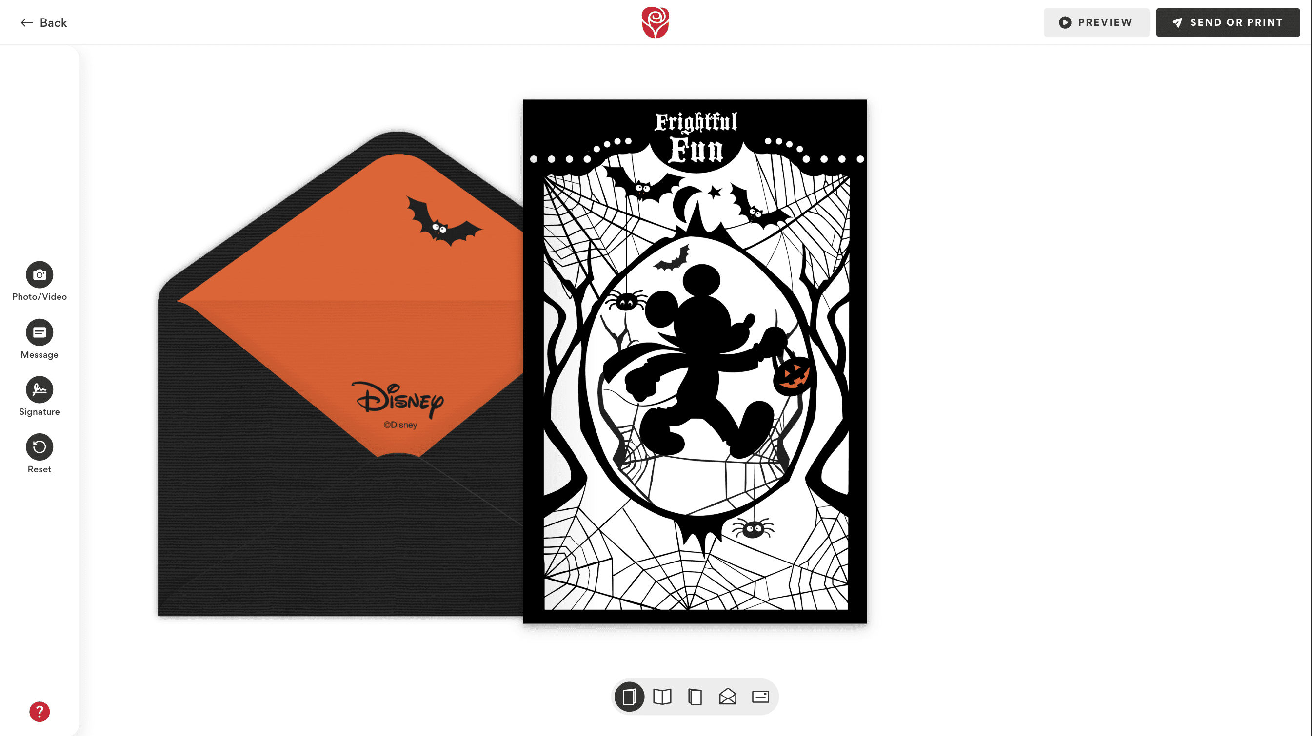
We replaced the old modal system with a universal drawer component that could be toggled open or closed at any time. The drawer dynamically updated its tools based on the area of the card being edited (ex. outside/inside of the card or envelope).
Below you can see the comparison of our old obtrusive modal system and the simplified drawer layout:


We ran multiple usability tests via UserTesting, asking participants to complete common personalization tasks such as:
Adding text to a card
Adding a photo to a card
Choosing a song and/or optional confetti
Switching between card and envelope views
Undoing or redoing an edit
Here's a video of one of our participants having a blast while customizing her envelope:
100% of testers found the new builder enjoyable and easy to use.
Users appreciated the freedom to customize at their own pace, step-by-step or freely.
The plus buttons clearly indicated editable elements.
Music and confetti confirmation banners reassured users their actions were saved.
The navigation toggle felt intuitive after initial use.
On mobile, some users tried to swipe through the card rather than using the nav toggle.
Many struggled to find the undo/redo feature.
Some didn’t notice UI changes between card and envelope views.
On desktop, adding text manually still needed refinement to feel seamless.

We took our findings from the usability tests and made further iterations to our prototypes. Afterwards, we shipped everything off to development for implementation!
The redesigned builder marked a major improvement for American Greetings. Users could now personalize cards without distraction, navigate easily between views, and feel more confident while making edits.
This project drastically improved overall Creatacard™ sends and usage on American Greetings, setting a new foundation for both desktop and mobile personalization experiences across the brand.


Redesigning the American Greetings digital greeting card builder.
Apr '24 - Jun '24
UX Designer
UX Researcher
The old builder was clunky, unintuitive and didn't promote easy personalization. Each personalization option lived within its own modal that, once active, would get in the way of personalization and had to be moved around the screen by the user in order to see the card that they were personalizing. Often times these modals wouldn’t even fully appear on the screen and would be outside of the viewport.
We know personalization is everything. How might we simplify the personalization process so users can easily preview and edit their card without obstruction?
We began by analyzing competitor platforms such as Hallmark, Givingli, Evite, and Paperless Post to understand how others approached digital card personalization.
Key takeaways included:
Simple, persistent editing panels performed better than multiple modals.
Inline editing and clear visual cues encouraged faster customization.
Visual continuity between editing states helped users stay oriented.
These insights validated our hypothesis that personalization tools should be consolidated into a single, accessible location.
After sketching early ideas, we transitioned into Figma to explore layout and interaction patterns. The guiding design principle was unobtrusive control, giving users power to personalize while keeping the card front and center.
We replaced the old modal system with a universal drawer component that could be toggled open or closed at any time. The drawer dynamically updated its tools based on the area of the card being edited (ex. outside/inside of the card or envelope).
Below you can see the comparison of our old obtrusive modal system and the simplified drawer layout:
We ran multiple usability tests via UserTesting, asking participants to complete common personalization tasks such as:
Adding text to a card
Adding a photo to a card
Choosing a song and/or optional confetti
Switching between card and envelope views
Undoing or redoing an edit
Here's a video of one of our participants having a blast while customizing her envelope:
100% of testers found the new builder enjoyable and easy to use.
Users appreciated the freedom to customize at their own pace, step-by-step or freely.
The plus buttons clearly indicated editable elements.
Music and confetti confirmation banners reassured users their actions were saved.
The navigation toggle felt intuitive after initial use.
On mobile, some users tried to swipe through the card rather than using the nav toggle.
Many struggled to find the undo/redo feature.
Some didn’t notice UI changes between card and envelope views.
On desktop, adding text manually still needed refinement to feel seamless.
We took our findings from the usability tests and made further iterations to our prototypes. Afterwards, we shipped everything off to development for implementation!
The redesigned builder marked a major improvement for American Greetings. Users could now personalize cards without distraction, navigate easily between views, and feel more confident while making edits.
This project drastically improved overall Creatacard™ sends and usage on American Greetings, setting a new foundation for both desktop and mobile personalization experiences across the brand.